About the project
INTERCRUS is a young brand of handmade interior ceramics from Italy. INTERCRUS is about imperfect shapes and textures. The natural colors of the products, which are inherent in the nature of the region where Kristin grew up.
Kristin (brand creator)
"In my childhood, my grandfather often talked about the night sky and the stars. In the gazebo near the house at night we watched the constellations. It was a carefree and very beautiful time. INTERCRUS is a star in the constellation Ursa Major. The name of my brand is a tribute to my grandfather. He taught me to find beauty in simple things."
"In my childhood, my grandfather often talked about the night sky and the stars. In the gazebo near the house at night we watched the constellations. It was a carefree and very beautiful time. INTERCRUS is a star in the constellation Ursa Major. The name of my brand is a tribute to my grandfather. He taught me to find beauty in simple things."
Services
Branding, business card design, poster, envelope and certificate, stickers, box design, tote bag.

Solution
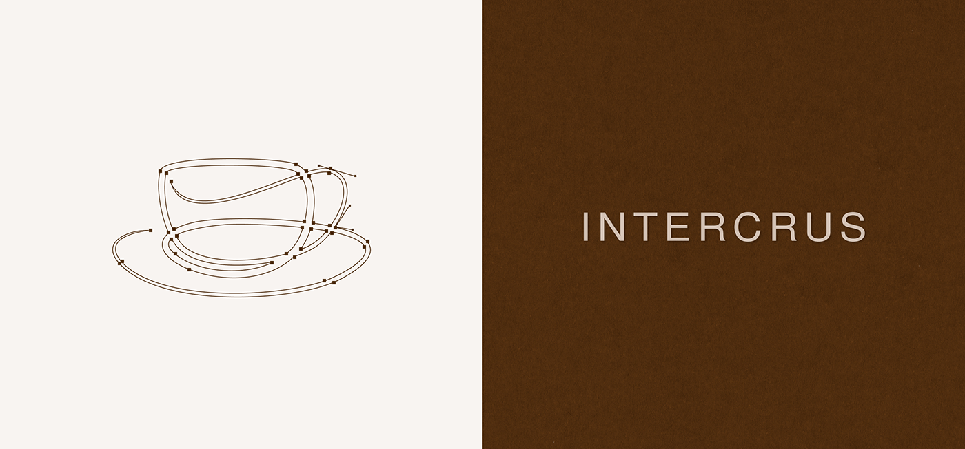
The purpose of branding was to convey the philosophy and build trust in the new brand. The color palette reflects the naturalness. The sign in the logo is made with soft lines. It reflects the plasticity of clay and the craft. And the straight font demonstrates the minimalistic design direction of ceramic products.
The purpose of branding was to convey the philosophy and build trust in the new brand. The color palette reflects the naturalness. The sign in the logo is made with soft lines. It reflects the plasticity of clay and the craft. And the straight font demonstrates the minimalistic design direction of ceramic products.


Polygraphy
Rational consumption and care for the environment is something that concerns everyone. Therefore, I decided to minimize the use of colored ink for printing. Recycled paper adds roughness and warmth, just like nature. The whole corporate identity resembles a vacation at grandpa's in the garden.


Thanks for watching
Designer: Katerina Goroshko
+375292054798 Telegram, WhatsApp
+375292054798 Telegram, WhatsApp
coskadesign@gmail.com


